Changing Lives Through Microlending
Redesigning a mobile experience to connect everyday spending habits to global impact.
The Problem
More than 1.7 billion people around the world are unbanked and can’t access essential financial services.
SaveForward set out to change that—by making it easy for socially conscious millennials to fund microloans through small everyday trade-offs (like skipping a coffee).
SaveForward set out to change that—by making it easy for socially conscious millennials to fund microloans through small everyday trade-offs (like skipping a coffee).
But their original web app wasn't gaining traction. The experience didn’t inspire users or reflect the emotional impact of lending. That’s where I came in.
The Goal
Redesign SaveForward’s platform as a mobile-first app that makes lending:
• Emotionally rewarding
• Intuitive and low-friction
• Financially safe for users
My Role
As Lead UX/UI Designer, I led the end-to-end redesign, from research and user journey mapping to final interface design and interaction patterns.
The Insight: "Saving" Wasn’t the Right Framing
During early testing, I discovered a key blocker:
- Users weren’t truly “saving”—they weren’t earning interest and often lost value over time.
So I proposed a bold pivot: shift the narrative from saving to spending less.
This subtle but powerful reframing made giving feel more achievable and emotionally resonant.
This subtle but powerful reframing made giving feel more achievable and emotionally resonant.
A new approach: What if skipping a $5 coffee could help someone start a business?
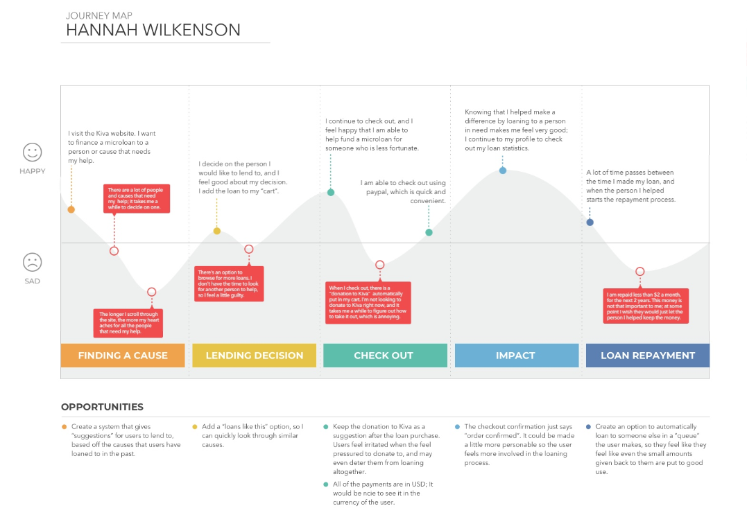
Journey Map: Hannah Wilkenson
To bring the research insights to life, I created a journey map focused on Hannah, a frugal student and socially conscious millennial. Her experience illustrates the emotional highs and lows of lending through existing platforms—revealing friction points like decision fatigue, checkout confusion, and a lack of emotional closure during repayment. These insights directly informed the product pivot and design priorities.
The Solution
To make lending feel approachable, I reframed the platform around “spending less” rather than “saving”—removing the pressure of traditional finance and replacing it with everyday, emotionally resonant choices.
💡 What if skipping a $5 coffee could help someone start a business?
This insight informed our core concept:
Whenever users consider an impulse purchase, they’re given the option to lend instead.
Whenever users consider an impulse purchase, they’re given the option to lend instead.
Why It Works
• It empowers users to give without feeling financially stretched
• It creates a sense of reward and purpose in everyday moments
• It builds consistency without requiring budgeting or micromanagement
Emotion-Driven Microinteractions
Because users are motivated by personal stories, I designed a system where:
• Lending is possible with a single tap
• Each action is connected to a real borrower and outcome
• No pressure—users can lend from repaid funds or skip without guilt
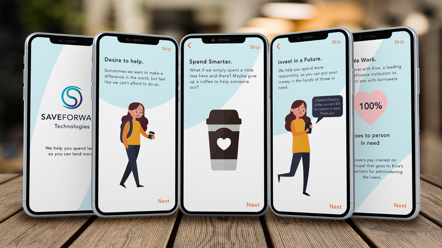
Onboarding for Emotional Engagement
The onboarding flow introduces this idea visually and clearly—spend smarter, lend better—and invites users into a low-risk, high-impact journey.
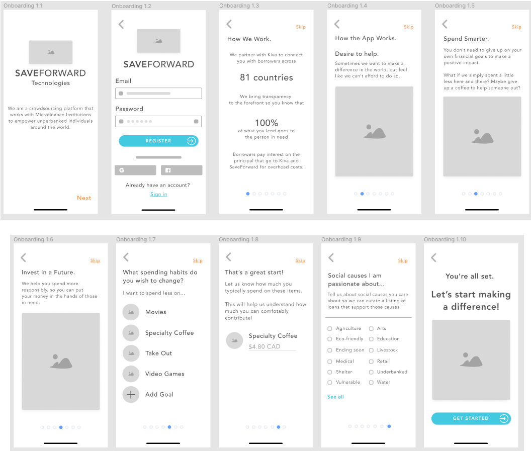
Illustrated onboarding screens show how small lifestyle changes—like skipping a coffee—can lead to meaningful impact.
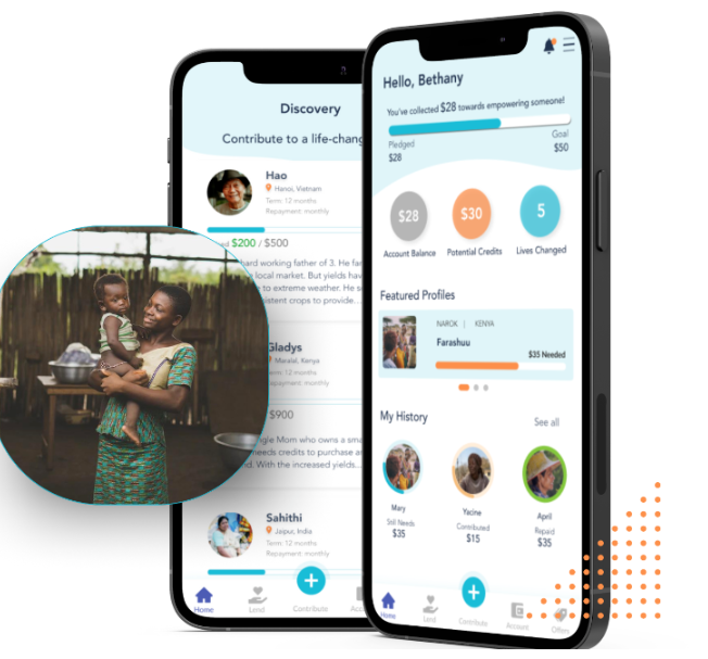
The Dashboard: Making Impact Visible
After onboarding, users land on a dashboard that delivers instant visibility into their impact:
• 💸 Total amount loaned
• 🌱 Money saved by lending instead of spending
• 🙌 People helped and countries impacted
• 💬 Borrower success stories to inspire more lending
This snapshot reinforces the core message: small trade-offs can drive meaningful global change.
Designed for Engagement
To keep users emotionally engaged and informed, I integrated subtle microinteractions throughout:
• A soft animation plays after a loan is made, offering positive reinforcement
• Real-time updates show progress on loans, helping build trust and transparency
• An interactive world map lights up with each new contribution, giving users a tangible sense of global reach
UX Enhancements
To ensure ease of use, I designed the dashboard with:
• Smooth transitions
• Animated loading states
• Progressive form validation
These enhancements reduced friction and improved task completion rates, especially for first-time users.
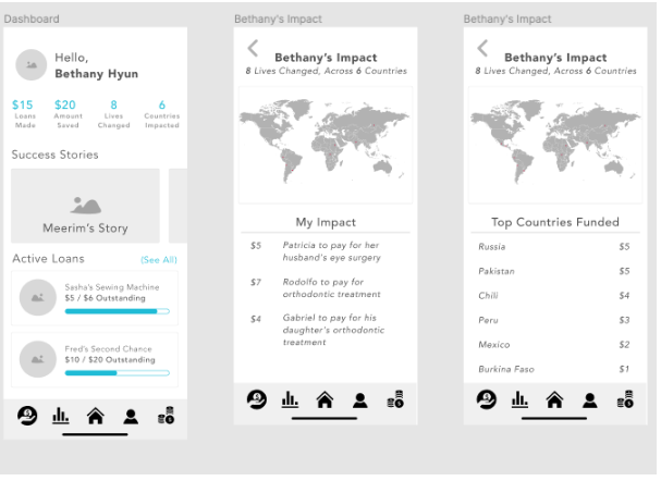
Bethany’s dashboard shows her lending footprint, personal milestones, and the lives she’s changed—all at a glance.
Final Design: Creating Emotionally Resonant Experiences
My design strategy focused on crafting a lending experience that’s not just functional—but emotional, intuitive, and empowering. This was especially important for users like Bethany, who want to help but feel financially constrained.
Onboarding: Connecting Intent to Action
The onboarding flow introduces a simple but powerful idea:
“Spend a little less—so you can give a little more.”
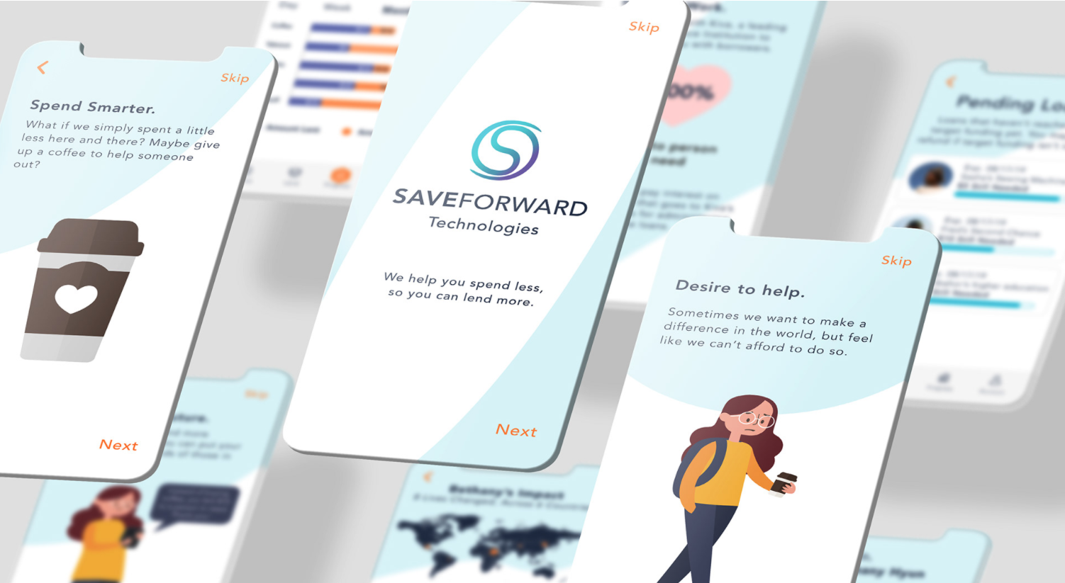
Illustrations and microcopy guide users to shift their mindset from consumerism to contribution—starting with something as small as skipping a coffee.
Core Features & Emotional Drivers
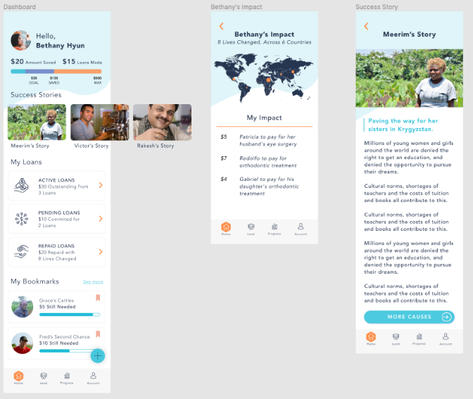
Dashboard Summary
• See savings, total loaned, people helped, and countries impacted
• Swipeable success stories reinforce the emotional payoff of lending
• Global impact map makes progress visible and tangible
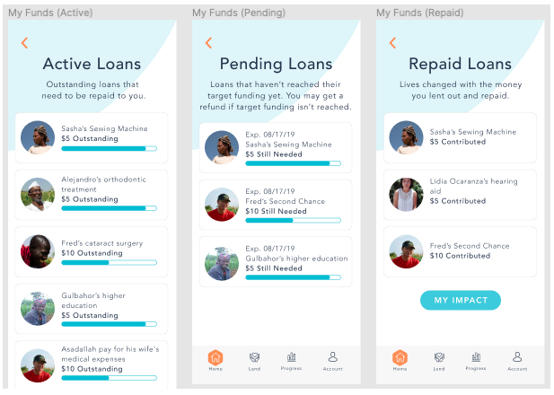
My Loans
• Track active, pending, and repaid loans
• Celebrate repayment with messages like “You’ve just helped someone again!”
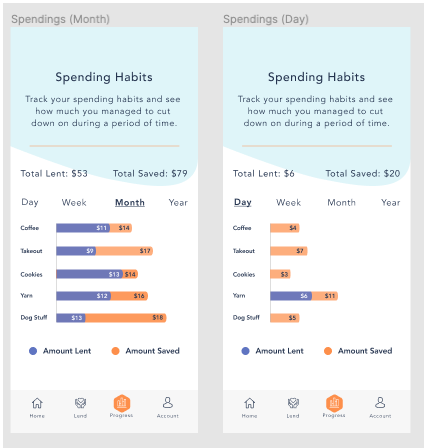
Spending & Progress Tracking
• Relatable charts help users visualize their trade-offs (e.g., coffee vs lending)
• Encourages reflection without financial guilt or pressure
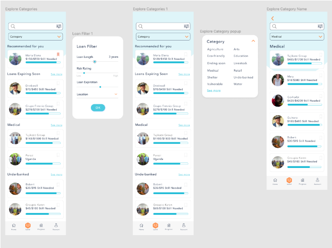
Personalized Recommendations
• Users can set spending goals and choose preferred loan categories
• Initial loan suggestions are matched to interests to build momentum
• Lending currency is framed in emotional terms (e.g., “Instead of buying X…”)
Flexible Lending Options
• Users can lend from credit cards or from repaid loan deposits
• Encourages reinvestment and long-term engagement
• At checkout, transparency is reinforced:
“96.7% of borrowers successfully repay their loans.”
“96.7% of borrowers successfully repay their loans.”
Outcomes & Impact
Following user testing of the prototype, we saw a 20% increase in engagement with the lending feature. This validated our emotionally driven design strategy and confirmed that connecting users to the impact of their lending motivates consistent participation.
SaveForward set out to empower socially conscious millennials to become micro-lenders—and our redesign delivered:
• A frictionless, mobile-first experience
• Personalized lending journeys that respected financial boundaries
• Emotional storytelling that inspired action without guilt
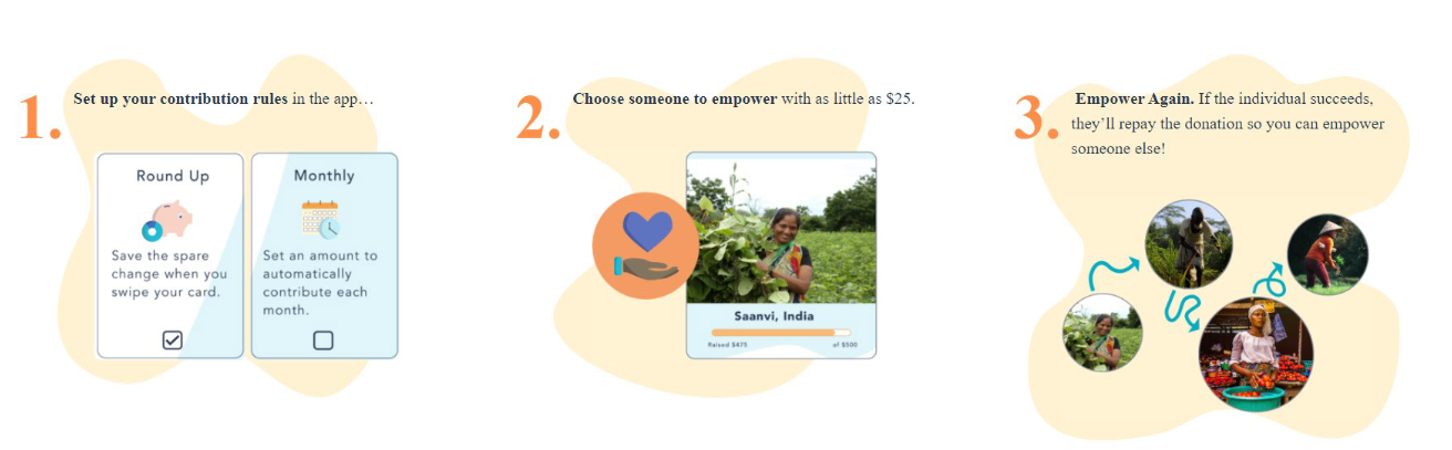
How it Works
My Contribution
As Lead UX/UI Designer, I:
• Identified a fundamental misalignment between product framing and user expectations
• Championed a strategic pivot from “saving” to “spending less”
• Conducted surveys, competitive analysis, and journey mapping to uncover emotional drivers
• Designed an interface focused on trust, impact, and empowerment
• Delivered a solution aligned with PIPEDA compliance for user data security
UX Content Design & Microcopy Strategy
To ensure the product inspired action while remaining inclusive and transparent, I led the UX content strategy, focusing on:
• Tone of Voice Definition: Crafted a voice that was encouraging, non-judgmental, and purpose-driven, helping users feel empowered rather than pressured.
• Microcopy for Confidence and Clarity: Wrote all in-app messages, tooltips, and CTAs with clear, plain language. For example, instead of “Complete your transaction,” I used “Send your loan now” — simplifying language to match user mental models.
• Emotional Framing: Reframed transactional moments as opportunities for connection — e.g., “You’ve just helped someone again!” on repayment screens.
• Onboarding & Empty States: Authored supportive onboarding copy and personalized empty state content (like “No active loans yet — ready to change someone’s story?”) to reduce drop-off and encourage exploration.
• Compliance-Aligned Messaging: Ensured all financial and data privacy messaging followed PIPEDA standards while remaining digestible and user-friendly.
• Consistency Across UI: Created a mini content style guide for the product team to maintain consistent language, tone, and hierarchy in future iterations.
Looking Ahead
SaveForward has since rebranded as ShareChange and launched the mobile app publicly in partnership with Penda Capital (Uganda). The design continues to support their mission to make micro-lending accessible, emotional, and meaningful.
“The experience feels like I’m part of something bigger—without feeling overwhelmed.”
— User Feedback (during Prototype Testing)
— User Feedback (during Prototype Testing)
TESTIMONIAL
Diane is a highly skilled and professional designer. She helped work on the SaveForward app design, from start to finish, contributing to user research, copy, UX, and more. We were beyond impressed with the prototype and additional business recommendations we received. I would definitely recommend Diane for any web, mobile app, or UX design projects. She is a pleasure to work with.
Celyn Brown
Co-Founder & CEO SaveForward
Co-Founder & CEO SaveForward
Want to work with us?