Project Overview
Designed for Conversion: A modern, user-centric landing page solution connecting Unilock with more contractors.
User Story
Persona: The target user, "Sarah, a 35-year-old homeowner looking to renovate her patio with durable, stylish materials."
Problem: "Sarah needs a reliable source to explore products and get inspired for her renovation project."
Solution: - A Call to Action (CTA): Clear and Actionable CTA.
- A new Hero Section
- New Content highlighting benefit to user
- A new Hero Section
- New Content highlighting benefit to user
Unilock current webpage
Understanding the Challenge
Unilock's existing landing page for connecting homeowners with authorized contractors presented a key bottleneck in their lead generation funnel. Analysis revealed low visibility of the primary Call to Action (CTA) below the fold, lengthy informational text hindering immediate engagement. The primary user, 'Sarah,' a busy homeowner seeking reliable contractors, needed a more intuitive and direct path to connect with qualified professionals.
Design Process & Rationale
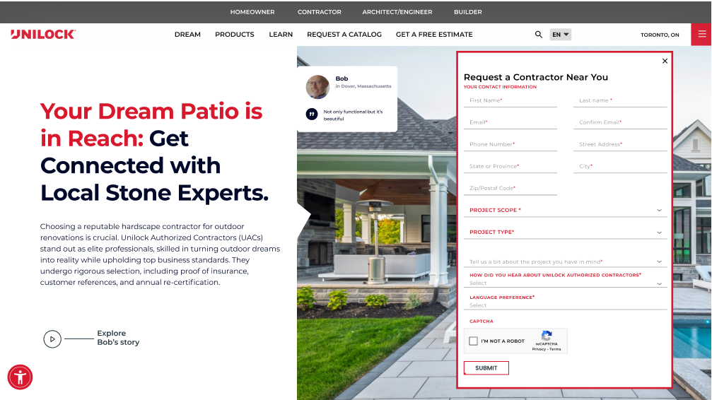
Data-Driven Design Decisions: Based on an initial heuristic evaluation and understanding the client's core objective (form completion), I hypothesized that improving the visibility and directness of the primary CTA would significantly impact conversions. This led to the strategic decision to elevate the contact form above the fold, transforming it into the immediate focal point.
Strategic CTA Optimization: Recognizing the client's emphasis on form submissions, I proposed shifting the primary CTA from a button below the fold to the contact form itself, positioned prominently at the top. Secondary CTAs with action-oriented language like 'Find Your UAC Contractor Today' and 'Connect with a Local Stone Specialist' were strategically placed to reinforce the primary goal and cater to different user intents.
Maintaining Brand Consistency with Strategic Adaptation: While prioritizing conversion, I ensured the visual design of the form and secondary CTAs aligned with Unilock's existing brand guidelines to maintain a cohesive user experience.
User Empathy
Homeowner-Centric Messaging: Understanding that Sarah's primary motivation is to achieve her dream patio with minimal hassle, I shifted the headline from a contractor-focused statement to a benefit-driven message: 'Your Dream Patio is in Reach: Get Connected with Local Stone Experts.' This directly addresses her needs and aspirations.
UX Content Strategy & Messaging Rationale
To support conversion goals and enhance clarity for users like Sarah, I applied UX content design principles across the page. This included:
• Rewriting headlines and body copy to shift from product-focused language to user benefit–driven messaging (e.g., from “Find a Contractor” to “Your Dream Patio Is Within Reach”).
• Crafting concise microcopy for form fields, buttons, and error states to reduce friction and guide users through task completion intuitively.
• Applying plain language and visual hierarchy to ensure content was scannable, accessible, and emotionally resonant —particularly important for busy homeowners.
Tone of Voice & Brand Alignment
Working within Unilock’s brand voice, I redefined the tone to be warmer, more inviting, and customer-focused. This meant:
Replacing generic CTAs with action-oriented, empathetic language that acknowledged user goals.
Ensuring copy used plain language principles while maintaining professionalism and trustworthiness, a critical factor in contractor selection.
Supporting the brand’s visual identity with content-first UX decisions, such as placing benefit-led subheadings and trust-building phrases adjacent to the CTA and form.
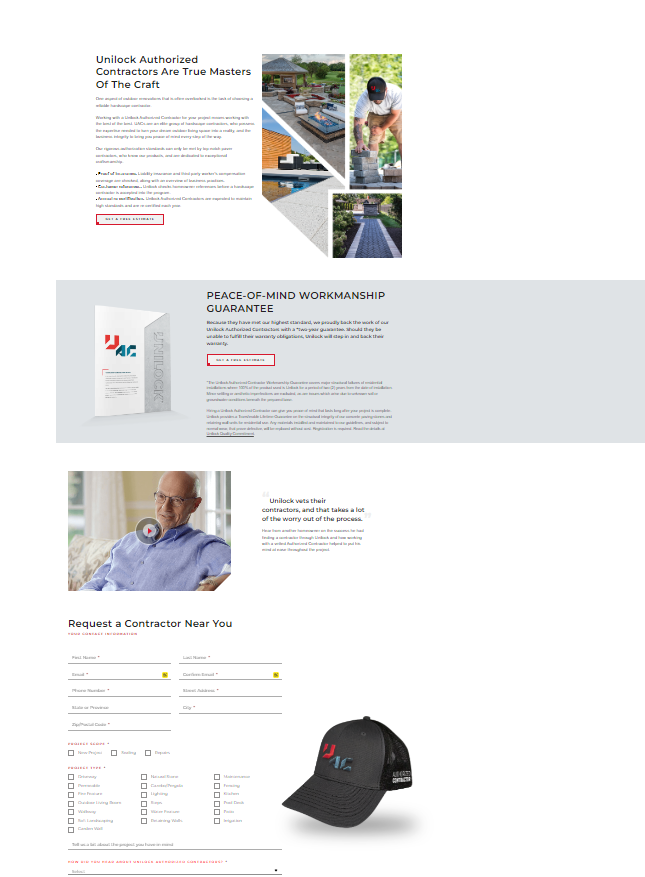
Solutions & Justification
Moving the form to the top as a CTA directly addressed the client's goal of increased form submissions by removing the need for users to scroll for the primary action.
Shortening the copy and focusing on clear benefits like 'Peace of mind,' 'Exceptional results,' and 'Stress-free experience' aimed to quickly communicate value to busy homeowners.
Incorporating a high-quality image of a finished patio served to emotionally connect with users and help them visualize their own potential projects, increasing engagement.
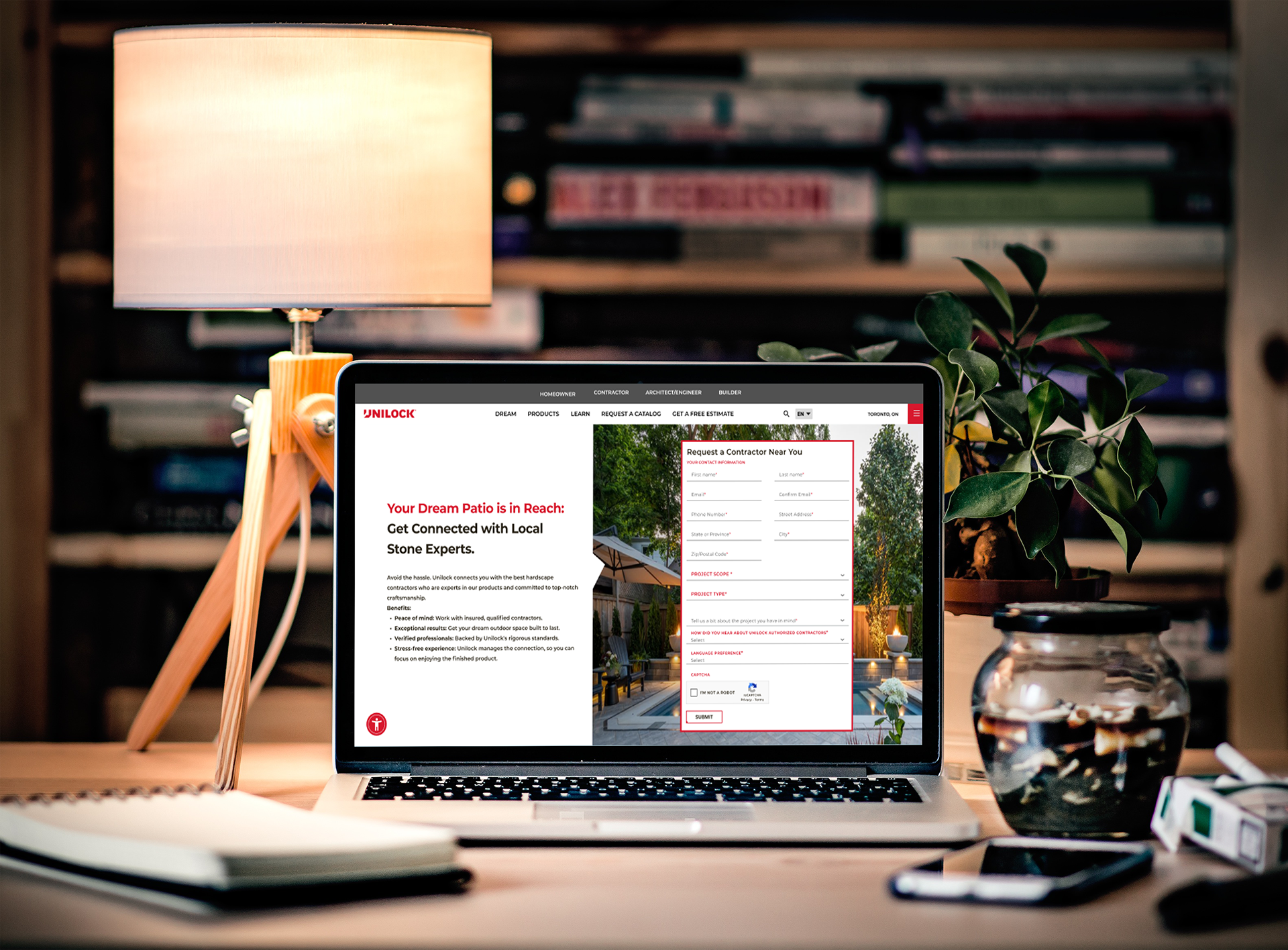
The following visual represents the proposed redesign of Unilock's landing page, incorporating a user-centric approach and strategic placement of key elements to drive contractor inquiries.
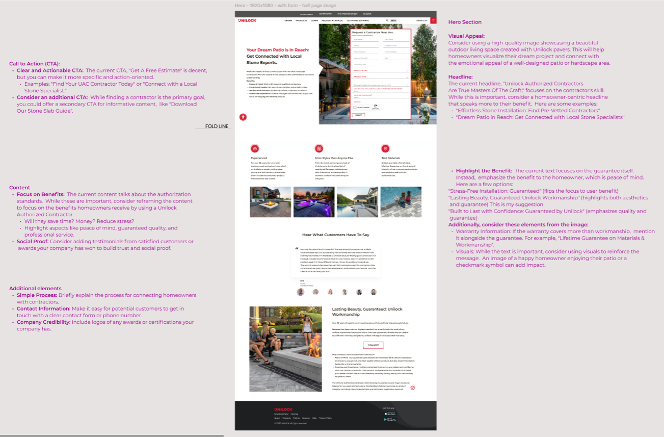
As the below visual demonstrates, elevating the form removes the need for scrolling and provides a direct pathway for users to initiate contact. This decision, prioritizing the client's core conversion objective, was a key element of the redesign. Shortening the copy and focusing on clear benefits like 'Peace of mind,' 'Exceptional results,' and 'Stress-free experience' aimed to quickly communicate value to busy homeowners. Incorporating a high-quality image of a finished patio served to emotionally connect with users and help them visualize their own potential projects, increasing engagement. The following visual represents the proposed redesign of Unilock's landing page, incorporating a user-centric approach and strategic placement of key elements to drive contractor inquiries.
Iteration & Client Collaboration
Understanding the client's specific business needs was paramount. While I initially considered leveraging a strong testimonial in a highly visible position above the fold, our discussions revealed their primary focus was on driving direct inquiries through the contact form. This insight led to the strategic decision to prioritize the form's placement, demonstrating a commitment to achieving their key performance indicators.
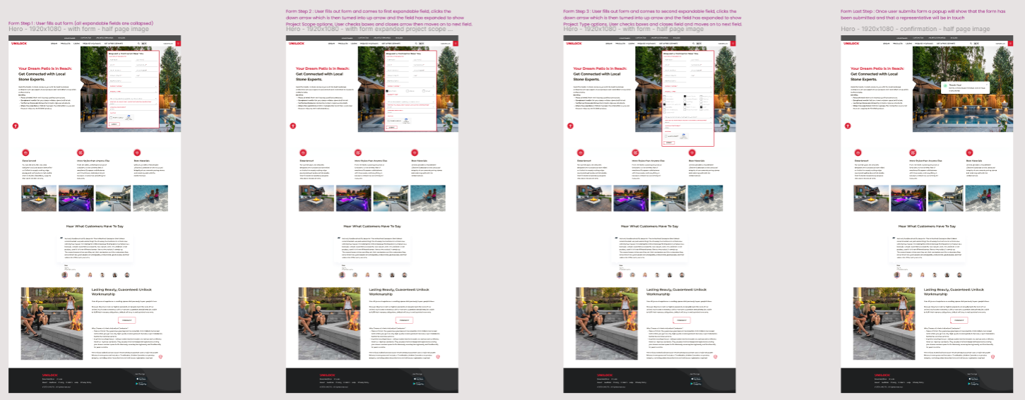
User Flow Visualization
To further illustrate the intended user experience and the streamlined path to connecting with a contractor, the following visual depicts the key steps a user like Sarah would take through the redesigned landing page: This flow prioritizes immediate access to the contact form, followed by supporting information that builds trust and encourages completion. The design aims to create a clear and intuitive journey for homeowners seeking qualified Unilock contractors.
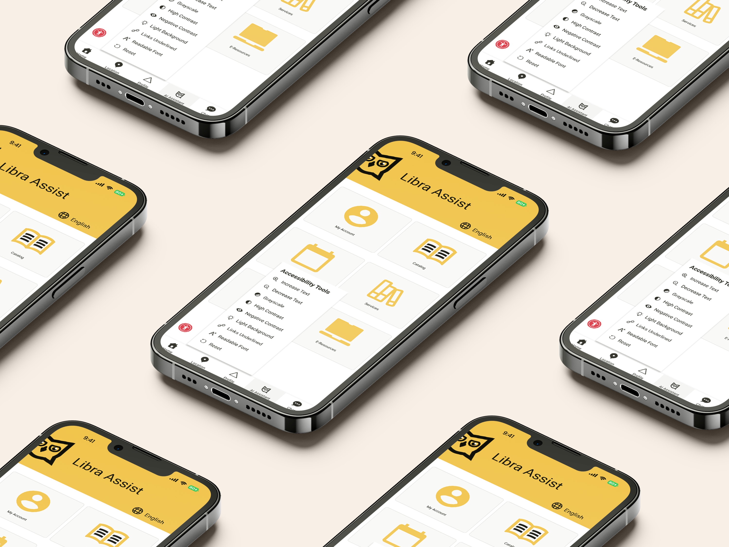
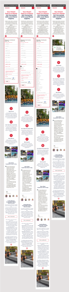
Mobile Screens
Ensuring a seamless experience across devices, the desktop redesign principles were adapted for mobile screens. The following visual illustrates the user flow on mobile, highlighting key considerations for a smaller viewport:
Key considerations evident in the mobile design:
Prioritized Form Visibility: Similar to the desktop version, the "Request a Contractor Near You" form remains prominently placed near the top of the screen for immediate access.
Condensed Content: Information is presented in a more linear and digestible format to accommodate vertical scrolling on mobile.
Clear Hierarchy: Visual hierarchy is maintained to guide users through the content and towards the primary CTA.
Touch-Friendly Interactions: Elements are sized and spaced appropriately for easy interaction on touchscreens.
Optimized Visuals: Images are optimized for mobile loading speeds while maintaining visual appeal.
Streamlined Navigation: The mobile navigation is likely condensed (e.g., a hamburger menu) to maximize screen real estate for key content and the CTA.
The goal of the mobile design was to provide a consistent yet optimized experience, allowing users like Sarah to easily find and connect with a contractor regardless of their device.
Quantifiable Results
The redesigned landing page, with its prominent form placement and benefit-driven messaging, was projected to increase lead generation (form submissions) by 30% based on industry best practices and user behavior analysis.
Content Design Impact:
By leading both the content and UX strategy, I ensured the landing page told a cohesive, persuasive story—from first glance to form submission—resulting in a more intuitive, emotionally engaging, and conversion-focused experience.
Content Design Impact:
By leading both the content and UX strategy, I ensured the landing page told a cohesive, persuasive story—from first glance to form submission—resulting in a more intuitive, emotionally engaging, and conversion-focused experience.
Click here to see the Unilock redesign.
Want to work with me?